

Identity
I love to draw. I also love symbolism. The challenge of identity is that everyone would like all of their vision and goals to be present in one mark without it becoming overly complex. When it is done, it needs to look obvious and right, as though it was there all along, regardless of the 50-500 solutions rejected before it looked so simple. The deception in this makes it hard to convince students to make many many versions before selecting. Malcolm Grear taught me that symbols should be timeless and memorable. Rob Roy Kelly taught me that they should be critically defined, but fluid, and include gestalt. This implicit tall order makes identity my favorite.
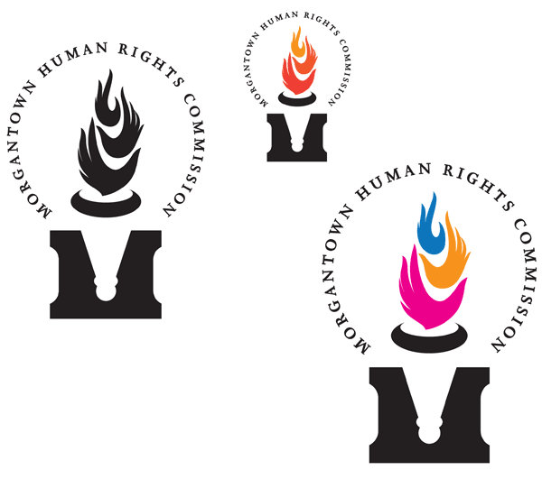
This solution allowed the classic Rob Roy tension curve to imply both hands and flame tongues in the torch. The M counter gives a gestalt base to the torch handle. The coloring makes it adaptable for protected classes or special events.
Flo Freedman | John Garlow | For Patrica, a network of cancer resources
Identity system for Fairmont State University
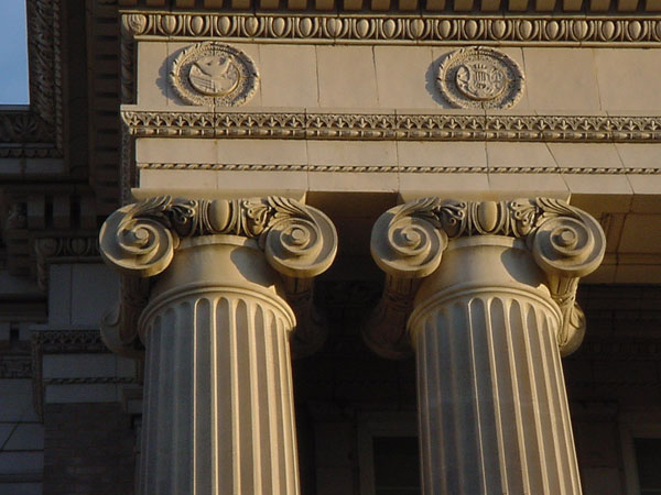
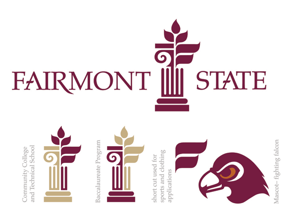
The symbol was based upon 14 key words, including academic, which stems from Greek traditions. Hardway Hall, in this picture, is an important campus feature, with its ionic columns. The tree component is based upon a historic pear tree on campus as well as growth and a network. The mascot is drawn in the same style.
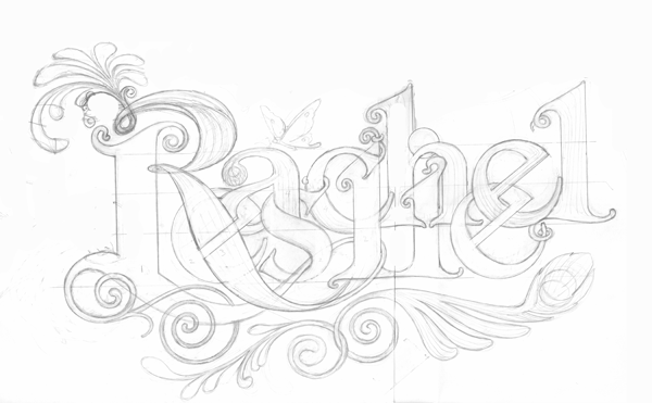
Drawing the letters is more fun than adapting a font. The intertwining was to celebrate a marriage in New York.
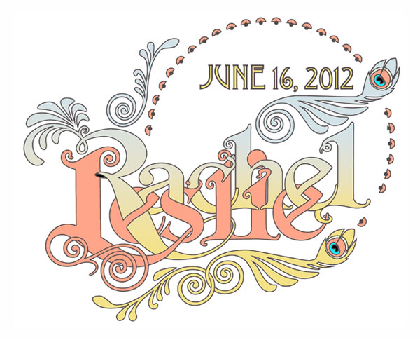
The solution also conformed to the request to channel Alphons Mucha, art nouveau, and peacock feathers. More of this in the Ethics section.
This added the most element into one symbol that I have ever drawn: clay vessel, fish, stained glass window, dove, hands, flames, cross, evoking numerous biblical texts, for the United Methodist Church.
Print Collateral
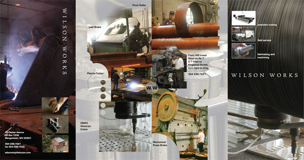
All my own photography made this accordion brochure a fun project. Wilson Works, a local metal fabricator, has equipment, including a water jet cutter, to make anything. I bartered for some special aluminum products I needed.
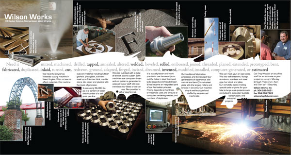
The inside unfolds to make a small poster of products.
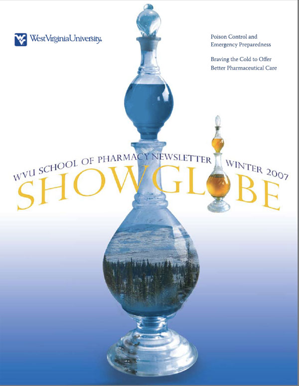
The showglobe is a historic symbol for pharmacies that dates back to feudal days. red coloring in the glass meant an epidemic, and to stay away from that town. This "globe" was in a local pharmacy and became a series of covers to illustrate feature articles.
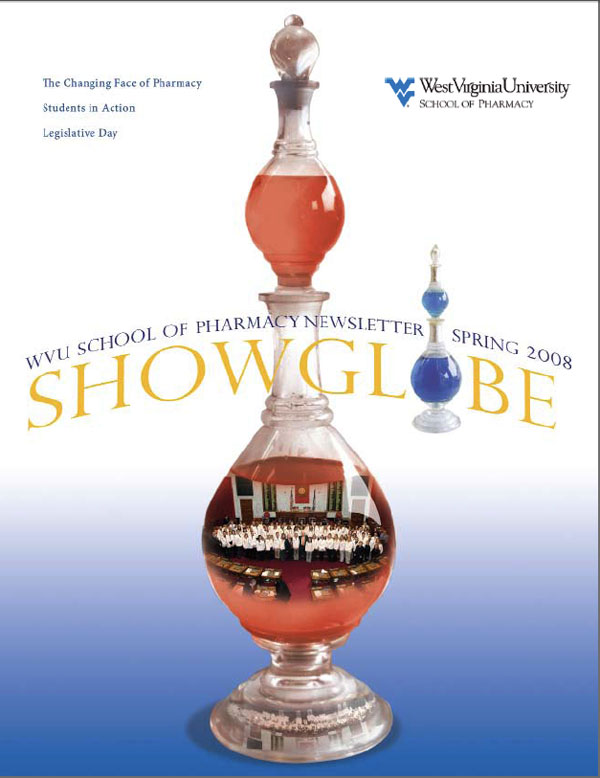
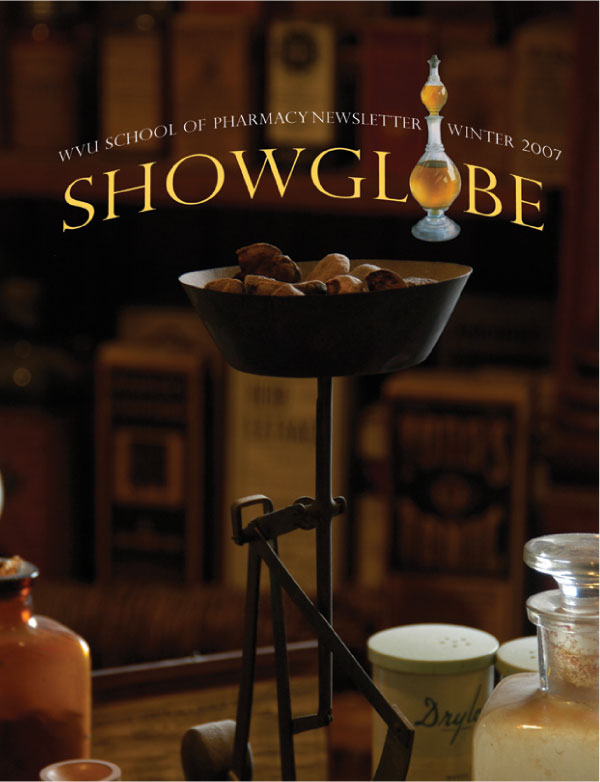
I photographed this still life in the WVU Pharmacy Museum.
Web sites
Yes, I can hand-code! But just recently. Still learning, but aren't we all?
WVU Graphic Design Site, which you should visit.
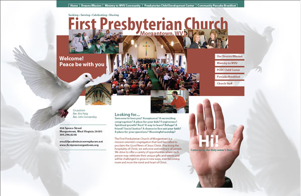
First Presbyterian Church in Morgantown, LGBT friendly, by the way.

Eco-mod-structure.com
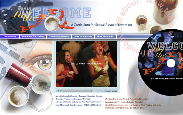
http://www.reelinsight.org A curriculum for Sexual Assault Prevention